
Instagram Feature Design
Scheduling feature to support content creators improve their engagement and outreach.
Instagram, boasting over 1 billion monthly active users, has evolved into a thriving platform for individuals and businesses. Its growth has paved the way for creators and businesses to monetize and expand their brands.
As part of a student-made project, I designed a scheduling feature aimed at enhancing engagement and expanding audience reach.
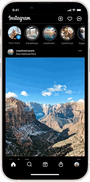
To view the final prototype, click here!
SUMMARY
ROLE
UX/UI, Research
TOOLS
Figma, Figjam
TIMELINE
2 Weeks
TEAM
Solo Project
CONTEXT
Insta-Biz — The Power of Social Media
Social media, especially Instagram, has become a dominant force, enabling businesses to connect with their audience and individuals to emerge as influencers and creators.
Having plenty of friends who have jobs based on social media, I heard that they were finding success on social media by strategizing and mass-creating content and pushing that content consistently. Time and time again, my friends would tell me how they wished Instagram had ways to support this strategy without becoming overly time-consuming and difficult.
PROBLEM
With Instagram’s current features, users struggle with manually managing and consistently releasing content to maintain engagement with their audience.

SOLUTION
A feature that helps users curate and plan their content and schedules.
Schedule your posts at your convenience, any day, any time.
Optimize your outreach with data-driven insights—precision planning for maximum impact.
Curate and refine your grid for a stunning feed. Tailor your profile to attract the community you love.
RESEARCH
Focusing on the subject
Despite defining my problem, I lacked a clear understanding of what Instagram was truly missing outside of a content scheduler. I had come up with goals I hoped to achieve through user interviews:
Understand how content creators manage their content
Determine what is blocking users from posting their content consistently
Learn what content creators do to increase audience engagement and interaction
User research revealed that while timely posting is a challenge, it alone doesn't ensure consistent audience engagement. This insight prompted further ideation. The key to consistent outreach and engagement boiled down to three main points:
Data
Data helps creators determine which content resonates most with their audience and pinpoint peak times when followers are most active and engaged.
Visual Planning
Creators stressed the importance of their profile's visual appeal for audience attraction and retention. They resorted to third-party apps to plan their Instagram grid.
Work-Life Balance
Without scheduling, creators must stay glued to their phones or risk missing prime posting times, disrupting routines and leading to content gaps.
Users strive to strike a balance between consistently pushing content for engagement and dedicating time to crafting quality and meaningful posts.
IDEATION
PART 1
Snapping from different angles
I had some questions that came up during the research phase that helped me decide how to go about ideating my feature:
💡 Feature Placement: How might we integrate the feature without disrupting the user’s content creation process?
I found that the placement of the feature would heavily impact the overall design. Did I want it live separately from all the other app’s features or should I incorporate it into an already existing area on the app? I decided that I needed to explore Instagram’s current information hierarchy and map out possible feature placements.
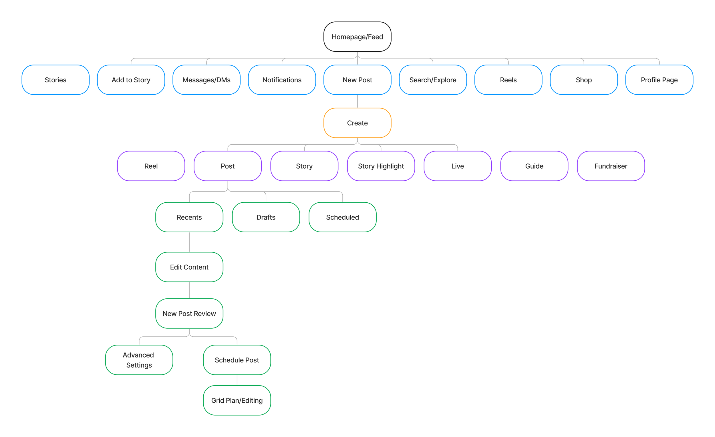
After multiple iterations, this site map was what I ended up with. I decided that the feature would take place within a currently implemented area of the app; the posting screens. Ultimately, the goal is to enhance the user’s current posting experience, and choosing this placement would do a few things:
Eliminate the need to build the feature from scratch
Limit the users’ need to learn something new
IDEATION
PART 2
Simplifying the process
💡 How might we reduce users’ efforts in scheduling /rescheduling their content?
Using the site map as a reference, I began to visualize the different possible scenarios that the user might take to prepare their content to be posted on their Instagram page. However, I realized that the feature would increase the number of taps users would need to take to complete their goal. This issue created an opportunity for me to reduce user effort as I mapped out the user flow to figure out ways to simplify their process.
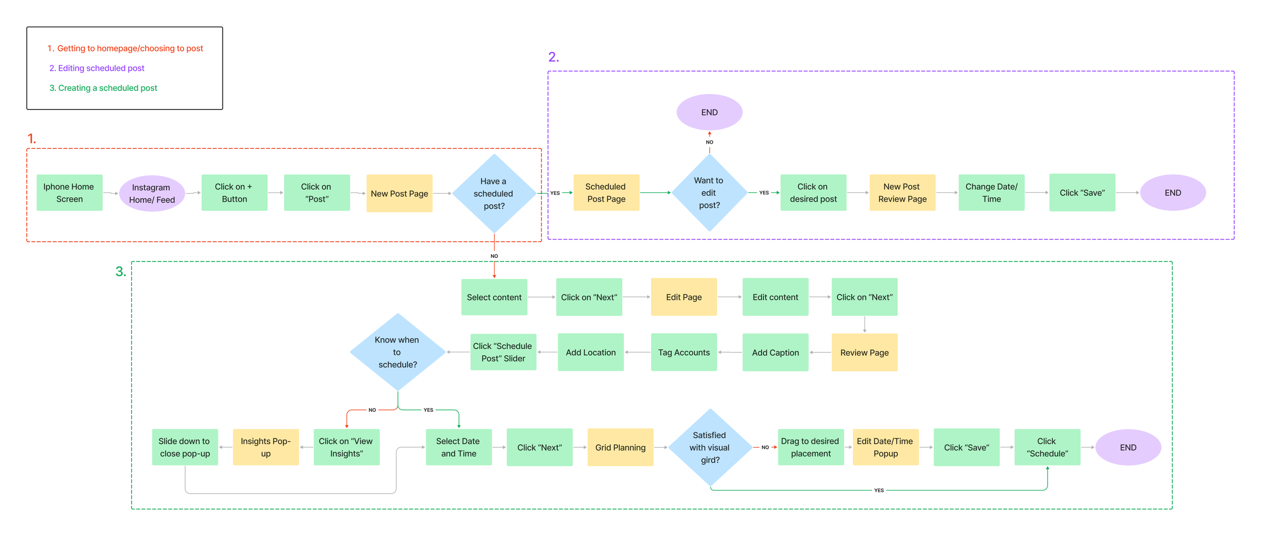
I needed to make sure that when users reached the scheduling point of their journey, they weren’t overwhelmed by new steps they were unfamiliar with that may turn them away from trying the feature. This included a few important points that I later referenced when I designed the interface:
Multiple scheduling options along their posting journey
User insights data needed to be somewhere visible on the screen, not on another page
Grid planning would need to allow users a way to change the schedule without adding bulk to the page.
DESIGN
The Challenge: Integrating seamlessly with Instagram's design system.
Having compiled my takeaways from the ideation phase, I began designing the interface, following Instagram’s current UI and designs.
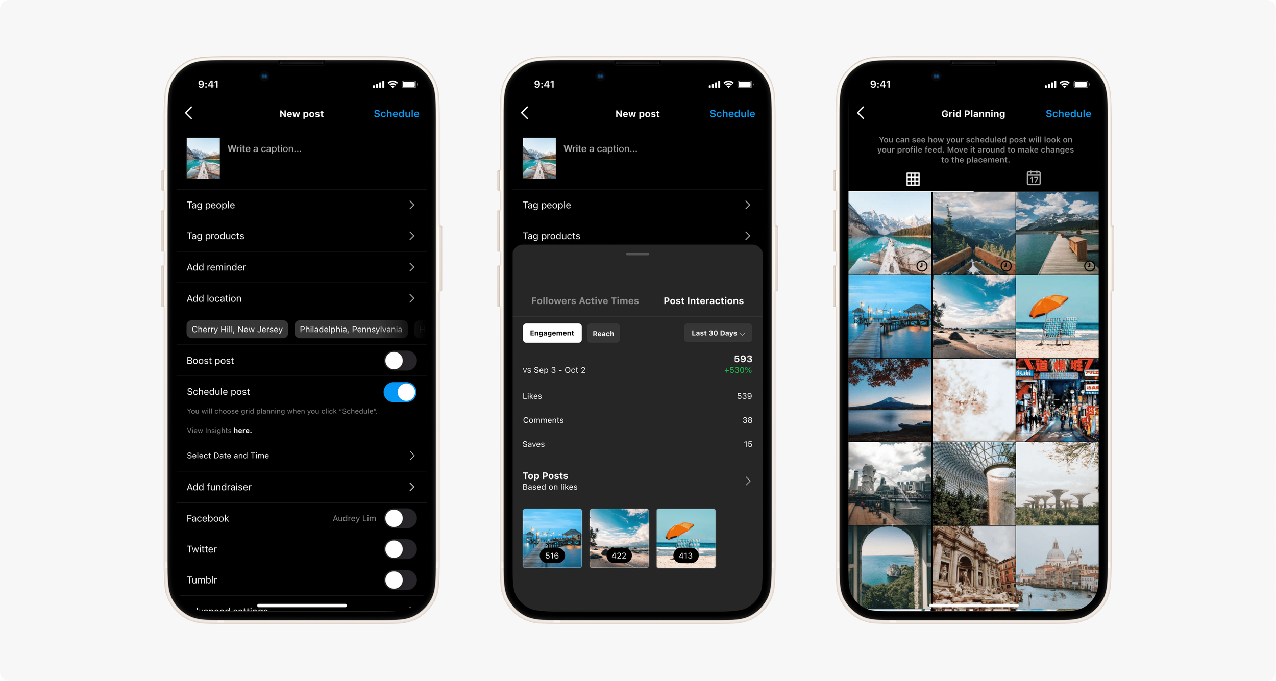
✧ Content Scheduling
I incorporated the feature into the existing content review page, utilizing Instagram's calendar design for the scheduling feature. Additionally, I opted for a pop-up to minimize the need for additional pages in the content creation user flow.

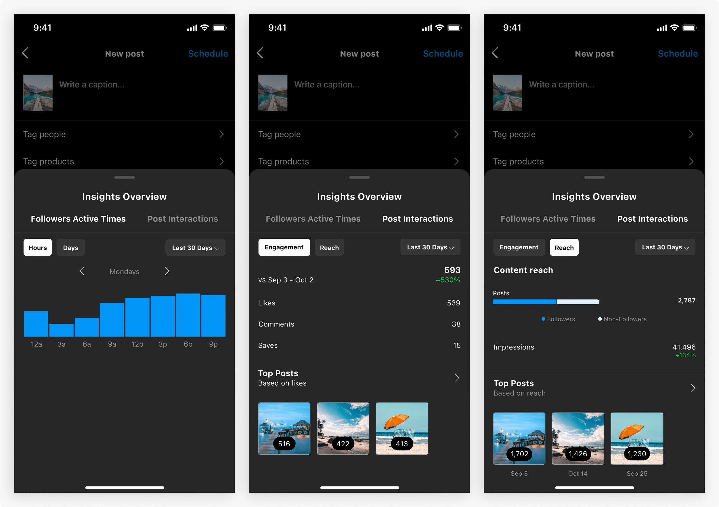
✧ User Insights
I integrated analytics into the scheduling section to provide accessible insights for users, aiding them in content scheduling and management. I pulled the data that was only available on a user's profile with a professional account and added it to the scheduling feature.
✧ Grid View and Planning
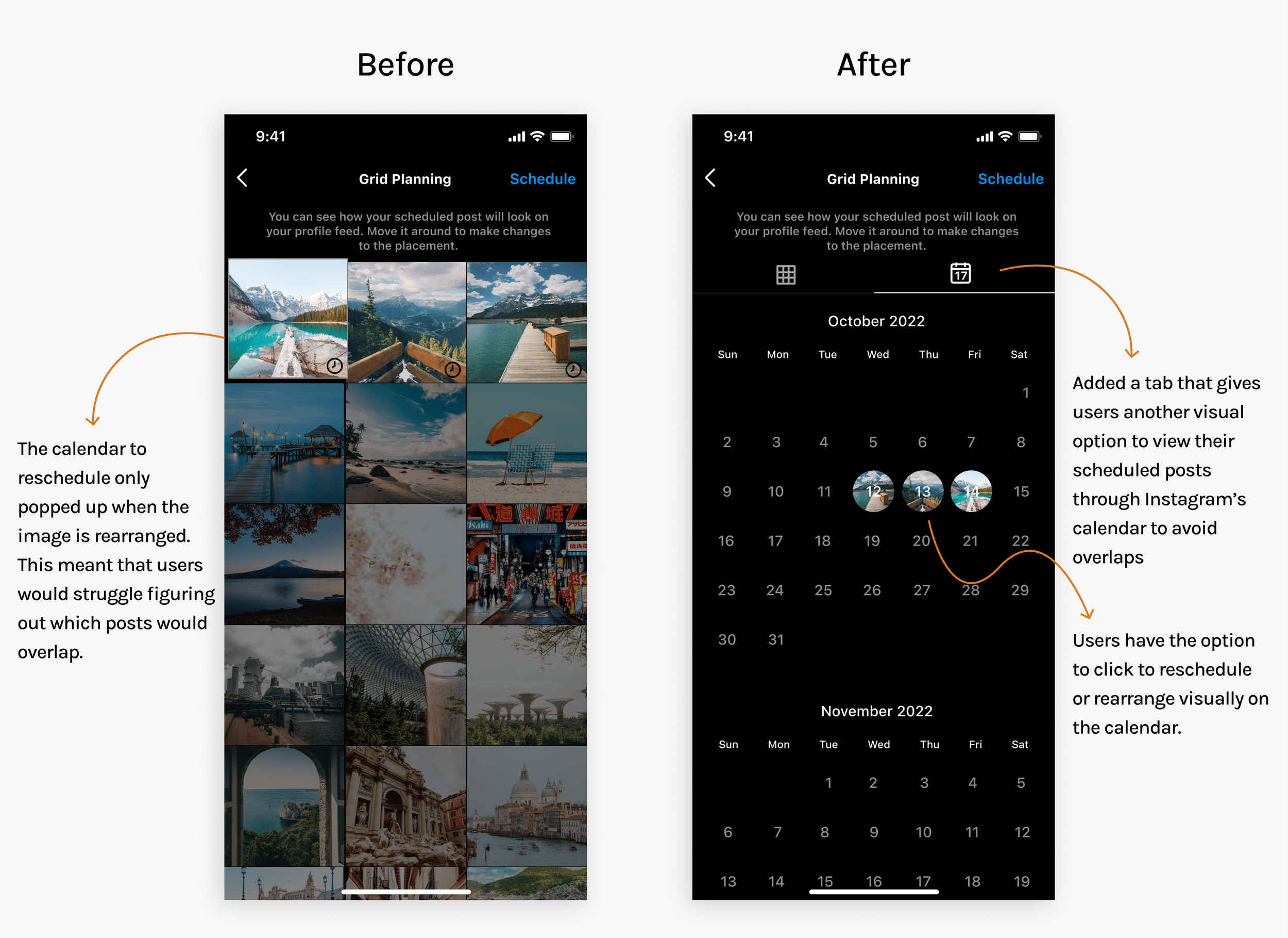
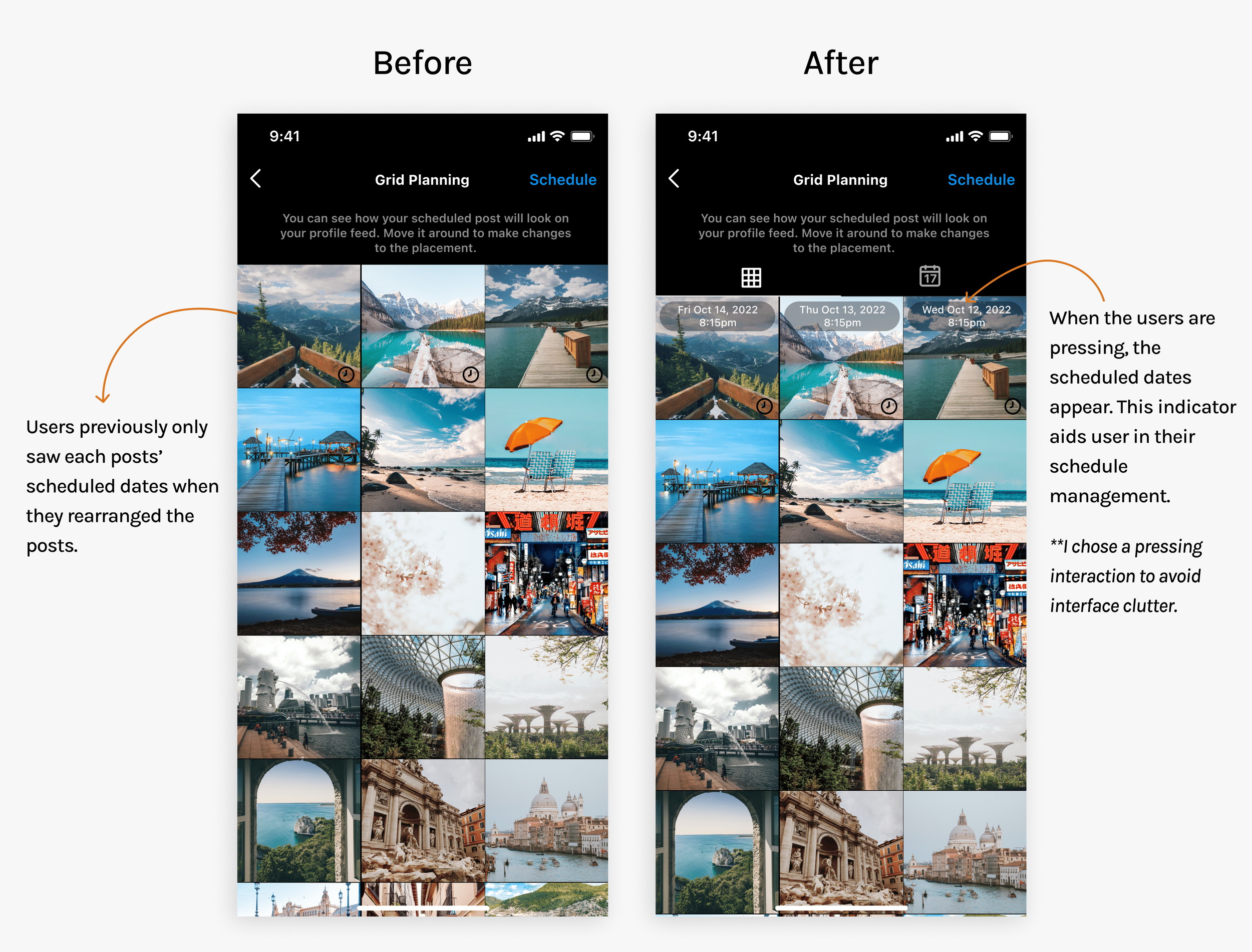
The grid view feature enables users to rearrange scheduled, unpublished content, allowing them to easily reschedule posts by simply moving them to a new position within the grid. This view also enables users to visually preview their entire current Instagram feed, facilitating aesthetic planning.

USABILITY TESTING
Editing and finetuning
Since it was my first time aligning with existing design systems rather than crafting my own, I needed to see how well my designs fit into Instagram's familiar interface. I provided the participants with two scenarios and tasks to complete based on the most commonly used cases and taking different perspectives into account. The first scenario tested the scheduling feature while the second tested the management and rescheduling feature.
Scenario 1: You are creating a new post that you want to schedule in advance.
Scenario 2: You want to reschedule/rearrange a post based on the look of the feed.
Pleasure Points ✔️
Every user scheduled the post with no issues
Feature felt natural within the interface
All users enjoyed having insights added
Users stated grid planning would be useful in their content creation.
Pain Points ❗
Confusion with next steps
Struggles with rescheduling through the grid planning feature
Lack of clarity on dates of currently scheduled posts
✧ Clarity within the user journey
Users found it confusing that the screens jumped from the content review page to the grid planning. They expressed a need for more clarity about what comes next in their journey. I opted to add clarifying text, similar to Instagram’s other features.
✧ Creating rescheduling options
Users faced issues when rescheduling on the grid planning page as the calendar view only appeared when posts were rearranged. I added another calendar tab, allowing users to visually review their scheduled posts by date to prevent scheduling conflicts.
✧ Visual indicators of dates
I found that users kept going back and forth between each post to view the scheduled dates on the grid planning. I made sure to add a pressing interaction that allowed users to view the date and time of each post to make rescheduling easier.

CONCLUSION
What I Learned
✧ New & innovative doesn’t always mean better for the user
In past projects, I had creative freedom to develop designs from scratch. However, in this project, I had to integrate my idea into an established app, facing participant difficulty with new features. To enhance usability, I incorporated familiar designs from other parts of the app. I learned that innovation isn't always user-friendly, especially for accustomed users.
✧ Address your biases
As an avid Instagram user, I initially believed I knew what users needed to see for my solution. However, research and usability testing revealed varying levels of technical literacy and feature awareness among users. This insight prompted me to create a solution that caters to all user groups, leading to changes in my final prototype. Research and testing were crucial in discovering a wide range of potential solutions.

Read my other case studies!

Medipill
Combating medical non-adherence and improving health management.
Immer
Revolutionizing the way entertainers interact with their audience virtually.