
Medipill App Design
Combating medical non-adherence and improving health management.

Medipill is a brand-new app created to help users take control of their health by tracking their medications, understanding the medication that they’re taking, providing refill reminders, and providing drug interaction warnings.
SUMMARY
ROLE
UX/UI, Research
To view the final prototype, click here!
TOOLS
Figma, Figjam
TIMELINE
2 weeks
TEAM
Solo Project
CONTEXT
It all started during the pandemic while working in a small clinic...
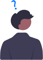
During my time working in healthcare, I came across an overwhelmingly large population of patients, specifically elderly POC, who were not taking their medication as directed. Although this is just my anecdotal experience, there is plenty of white-paper research that points to a serious issue that is affecting communities across the world.
Some facts:
30-50%
US adults do not adhere to long-term medication treatment.
1 in 5
new prescriptions are never filled by recipients.
$100 billion
in preventable costs annually due to prescription non-adherence.
PROBLEM
Poor medication adherence and drug misuse harm patient health and raise costs by increasing hospitalizations and resource consumption.
SOLUTION
Medipill: Manage and learn about your health
Medipill is an app that helps users manage their health with the help of reminders, education, and personalization. The goal is to empower users to take better care of themselves and live healthier lives.
RESEARCH
Have you been taking your medicine? 🤨
To validate my ideas, I jumped into research and interviewed 5 people who take daily medication. I wanted to understand their relationship with their chronic illness and medication which would give me insight into the problem space.
During the interviews, I learned that forgetfulness and poor timing of their medication intake schedules disrupted their regular life, as I had initially expected but there was more to the story. Living with chronic illness is no easy task.
✍🏻 Key Takeaways
Regular reminders and medication schedules are inflexible and hard to keep up with.
Interviewees felt they couldn't manage their health well because they didn't understand their diagnosis and medication.
“Taking medication is frustrating. I always have to keep track of five pills at once and I’m not even sure what they’re doing.” — Mike
IDEATION
PART 1
Examining the Anatomy
Having identified the problem and gathered my research insights, I had some questions that guided me through my ideation process:
💡 How might we create an environment that empowers users to take charge of their medical decisions?
Initially, I aimed to create an app for easy communication between users, medical providers, and pharmacies. I encountered challenges in avoiding information overload and preventing users from feeling constantly monitored, which could disrupt their routines.
I scrapped the idea as a whole and geared toward a medical reminder app but based on my research, regular alarms were already somewhat ineffective. Instead, I explored different features to enhance the effectiveness of the reminders, as reflected in my user flow.
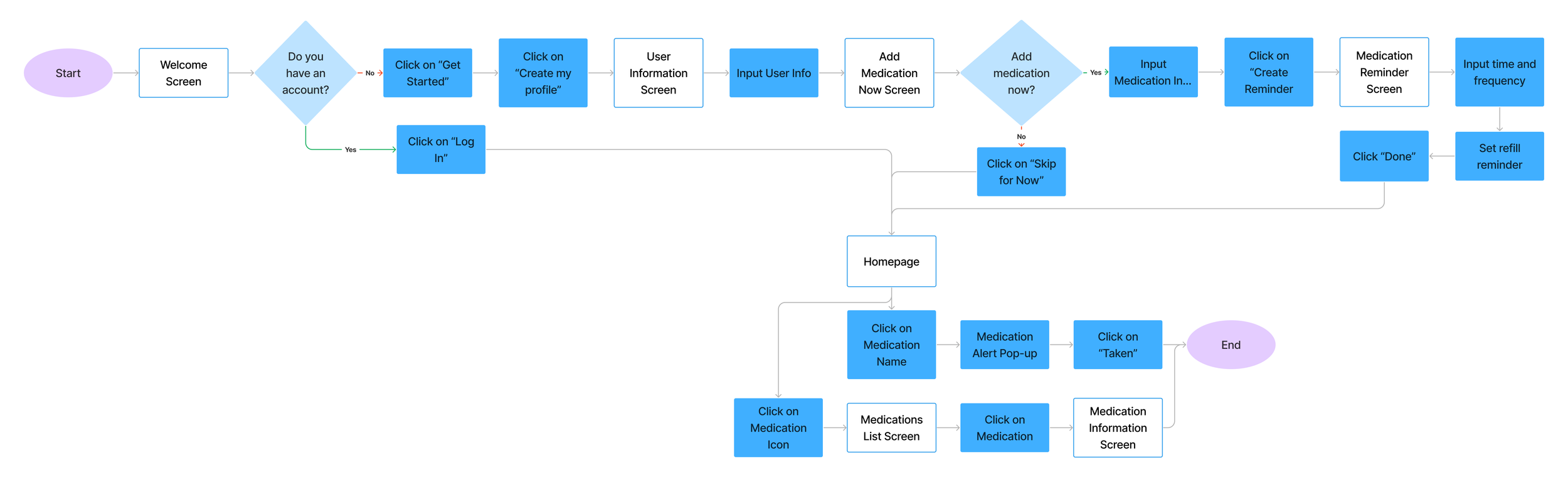
I was able to find opportunities to add personalization features throughout the user flow. Doing so made the whole journey feel more personal and allowed users to gain back a sense of control over their health. This user flow became the framework I referenced when exploring possible personalization features while designing the interface (Ideation Part 3).
IDEATION
PART 2
Let’s get the hard stuff out of the way
Having identified the problem and gathered my research insights, I had some questions that guided me through my ideation process:
💡 How might we streamline medication management and scheduling for users?
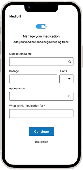
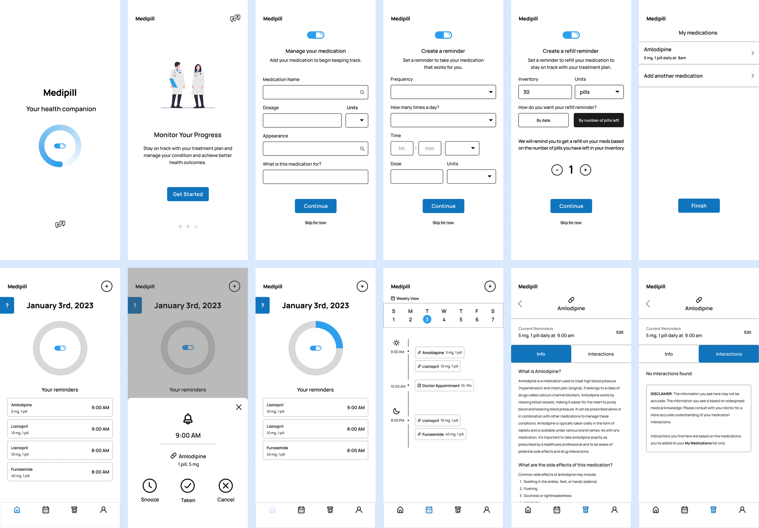
Using my User Flow as a reference, I created wireframes for onboarding and medication reminder screens. I opted to organize my initial wireframe screens around onboarding, which would involve setting up user accounts, scheduling, and medication information for users as they embarked on their journey with the app. This approach aimed to achieve two goals:
Introduce users to the layout and design of the app so that they can navigate it with ease.
Address the more "complex" tasks upfront, enabling users to concentrate on the medication reminders and educational features of the app that they would be using regularly.
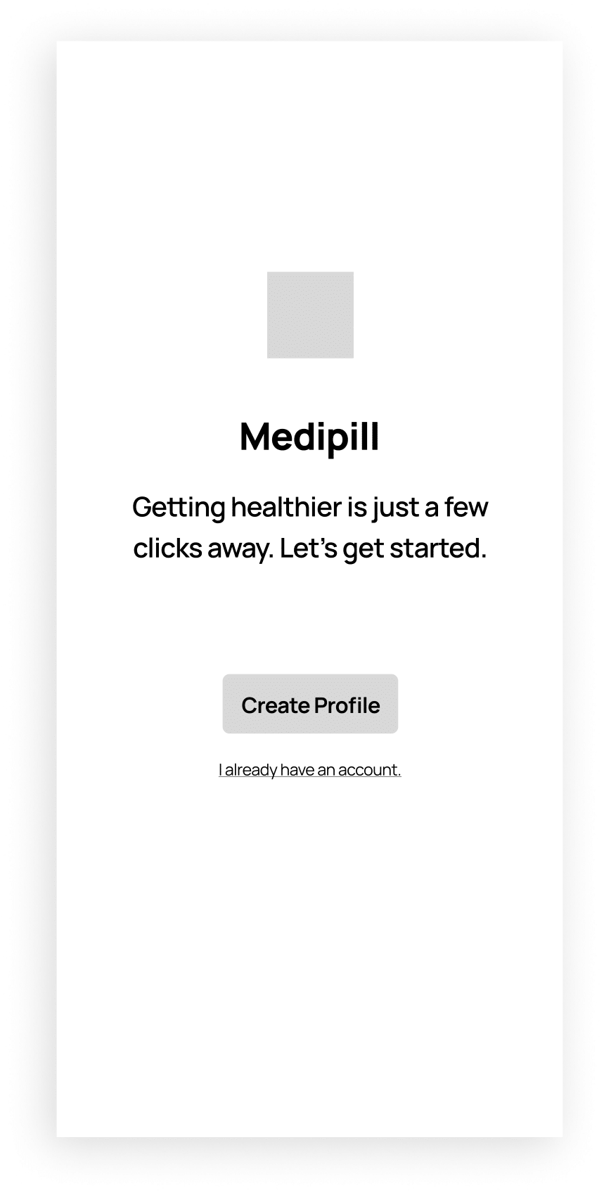
1. Onboarding — Create Profile
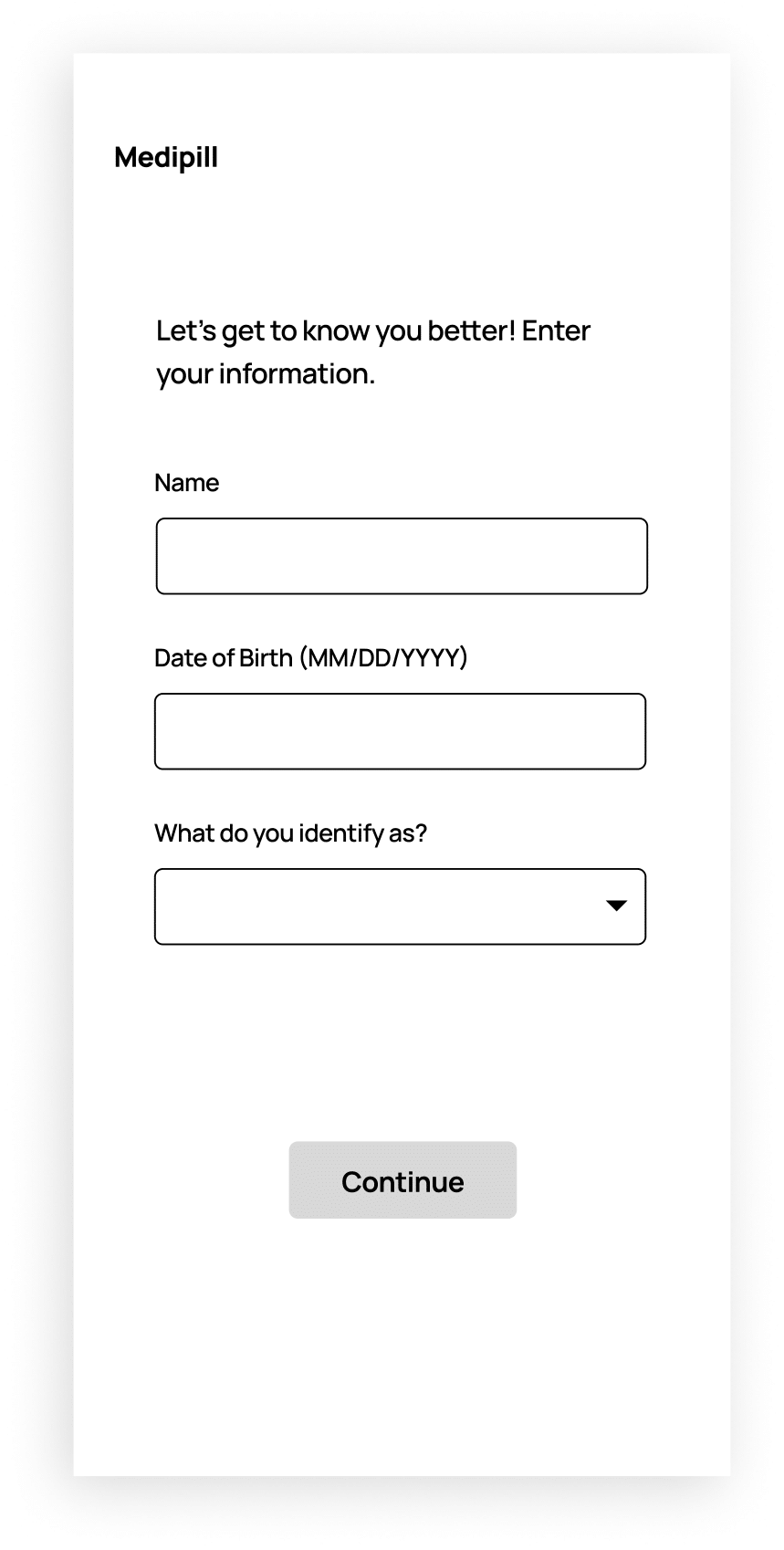
2. Onboarding — Profile Information
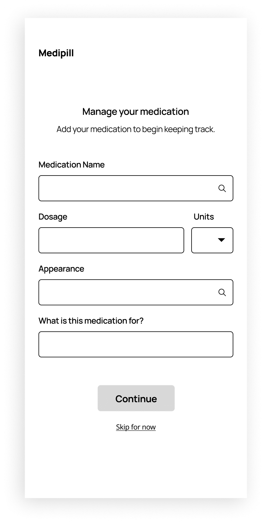
3. Onboarding — Medication Information

4. Onboarding — Refill Reminder
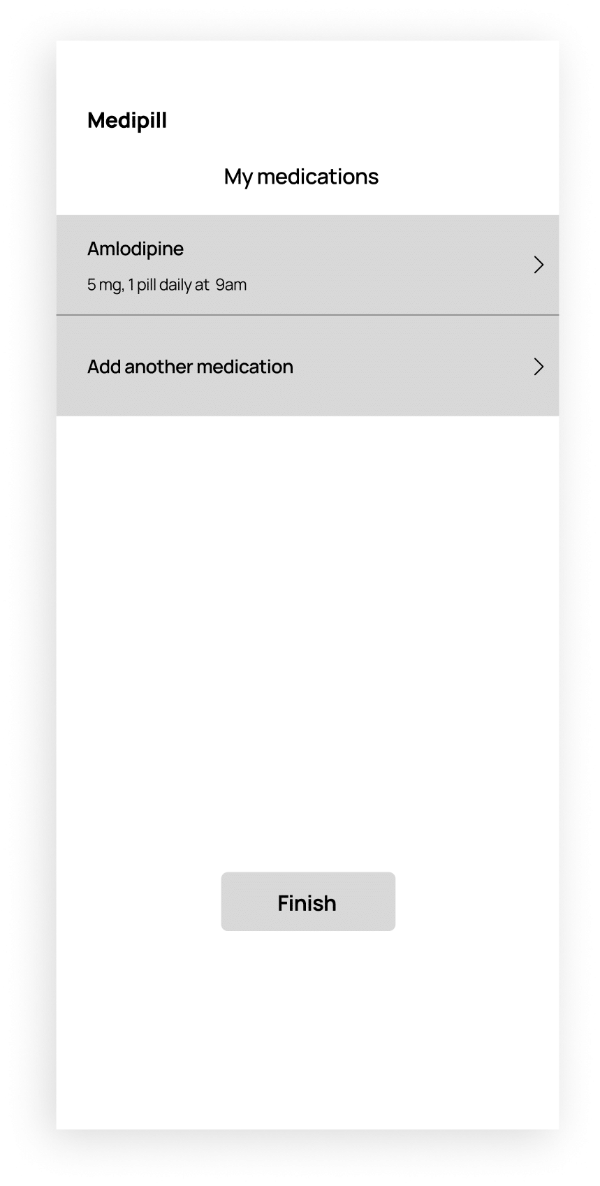
5. Onboarding — Medication List
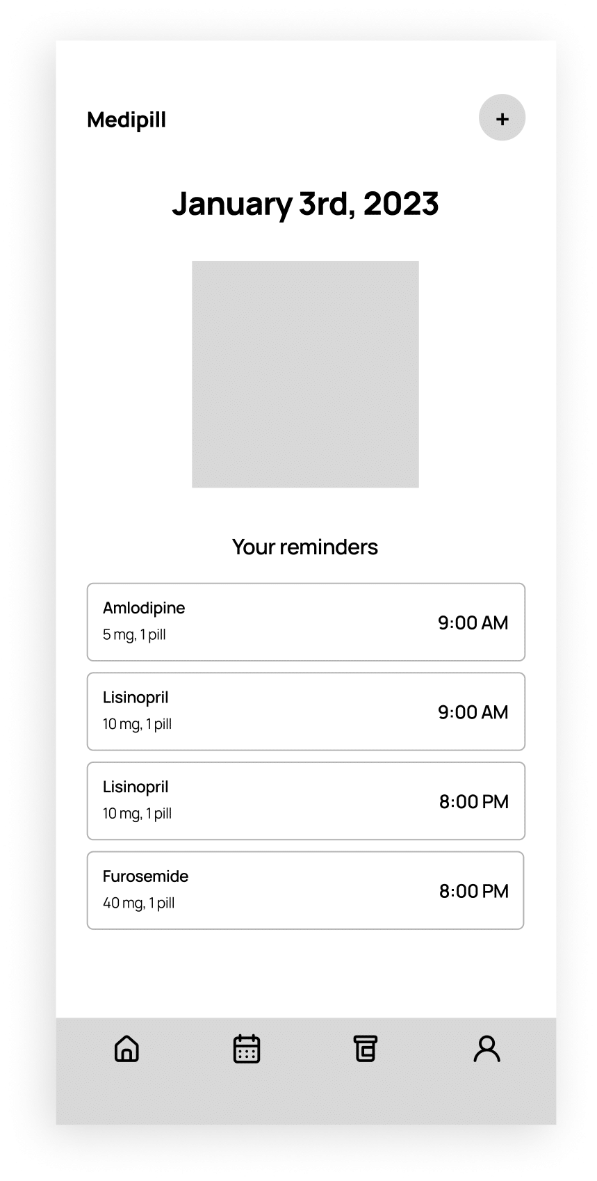
6. Home Screen
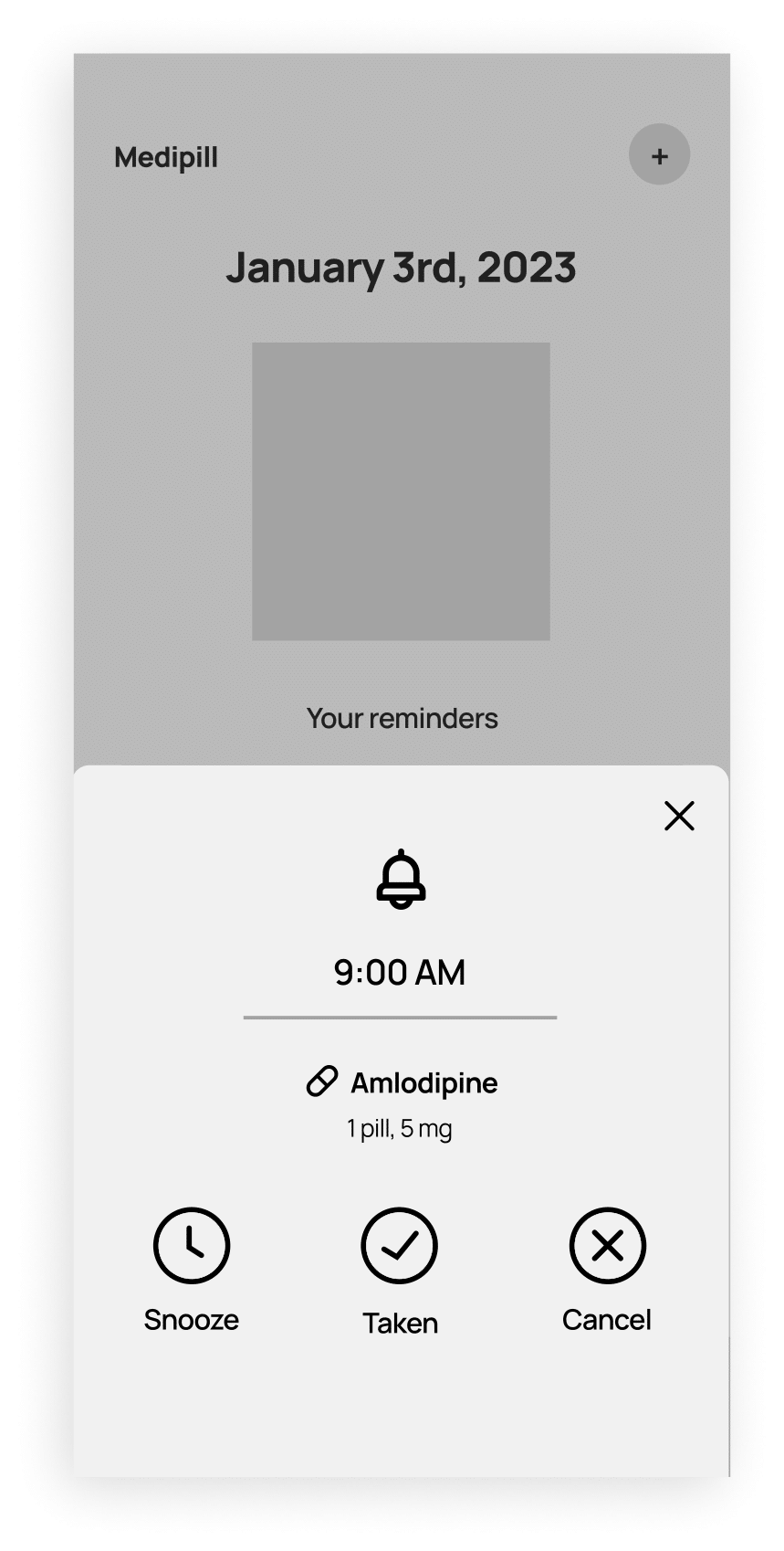
7. Home Screen — Medication Reminder Popup
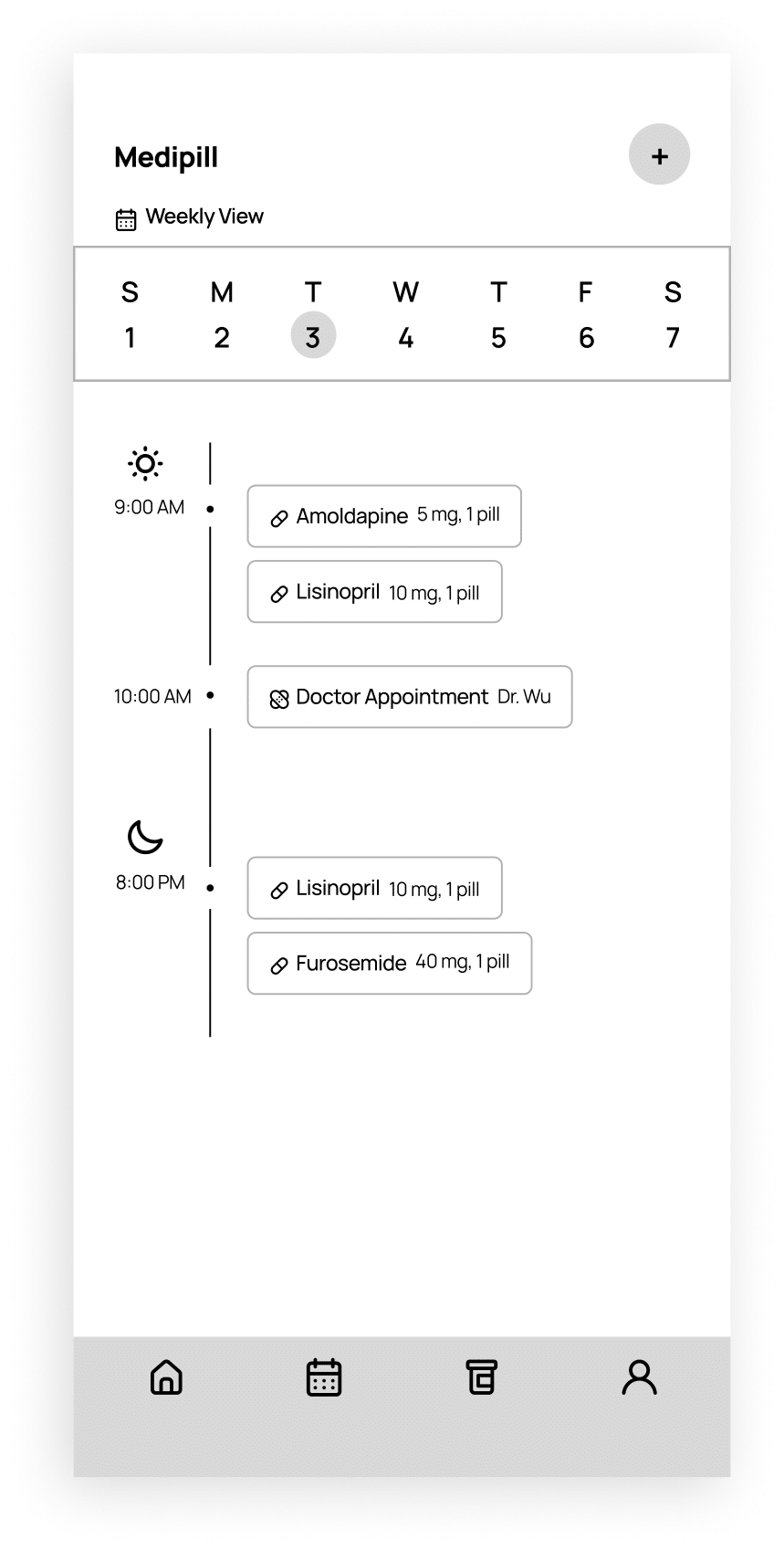
8. Weekly Calendar Screen
IDEATION
PART 3
Putting you and your health first
💡 How might we make the user experience feel personalized and enjoyable?
Having designed the option for users to create profiles and reminders which already added a touch of personalization, I referenced the site map once more to explore other ways users could interact with the interface in an engaging way.
✧ Visual Cues
To encourage users to continue taking their medication, I designed a progress bar circle that changed according to when users marked off a medication. I also took this approach because I wanted to create the potential to gamify this feature in the future.

✧ Weekly Calendar View
To address the potential for overlapping and confusing medical schedules, I implemented a weekly calendar view. I drew inspiration from the Apple Calendar app, admiring the way users could effortlessly view their entire day on a single screen and coordinate visually.
✧ Medication Education
The majority of users had mentioned that they didn’t understand their medication or illnesses, adding anxiety to an already stressful situation. While ideating a solution, I focused on creating a section focused on educating users on the medication they were taking and possible interactions between medications.
** I opted against including an education section on specific medical illnesses to prevent potential misinformation. Since medical conditions can vary widely among patients, particularly those with multiple chronic diseases, the medications they take may not always directly correspond to their diagnosed conditions. It's important to emphasize that this app does not replace medical advice from healthcare professionals.

USABILITY TESTING
Gathering the test results
To evaluate my solutions and designs, I recruited and interviewed 5 participants with varying backgrounds to discover what they enjoyed about my designs and what my designs lacked to provide for their experience so I could determine important revisions that needed to be made. I asked my participants to complete tasks in two different scenarios:
Scenario 1: You are new to Medipill and looking to create an account. Complete the Onboarding Screens.
Scenario 2: You are looking to mark that you’ve completed taking your first medication of the day (Amlodipine 5mg). Please mark the medication as taken.
Pleasure Points ✔️
Layout and design felt intuitive
Features were easy to find and straightforward to use
Users liked having access to education
Enjoyed the visual cues when completed a task
Pain Points❗
Issues with marking medication as taken
No features to learn how to use the app
Multiple options for scheduling medication reminders was confusing
Lack of access to language change
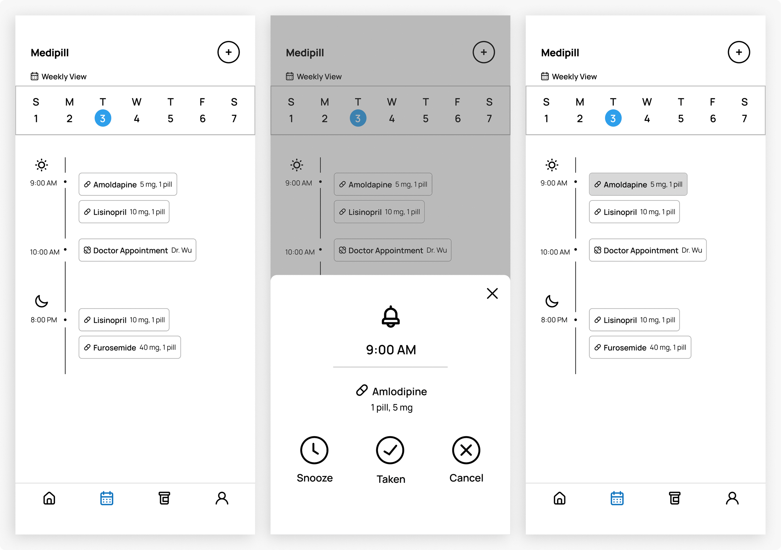
✧ Designing Different Interactions
Based on feedback, I discovered users struggled to mark medications as taken. I introduced a new interaction allowing users to click and kept the swipe interaction, offering them various ways to interact with the feature.

✧ Improving App Familiarity
To assist less tech-savvy users or those with memory issues, I added a question mark icon for accessing a tutorial on how the app functions.
Time constraints prevented me from designing tutorial screens, but the icon's presence leaves room for future expansion of this aspect of the app.

✧ Increasing Scheduling Ease
I incorrectly assumed that having a pre-made selection would make it easier for users to pick their schedules. The new revision gives users a familiar and common pattern to use when scheduling.

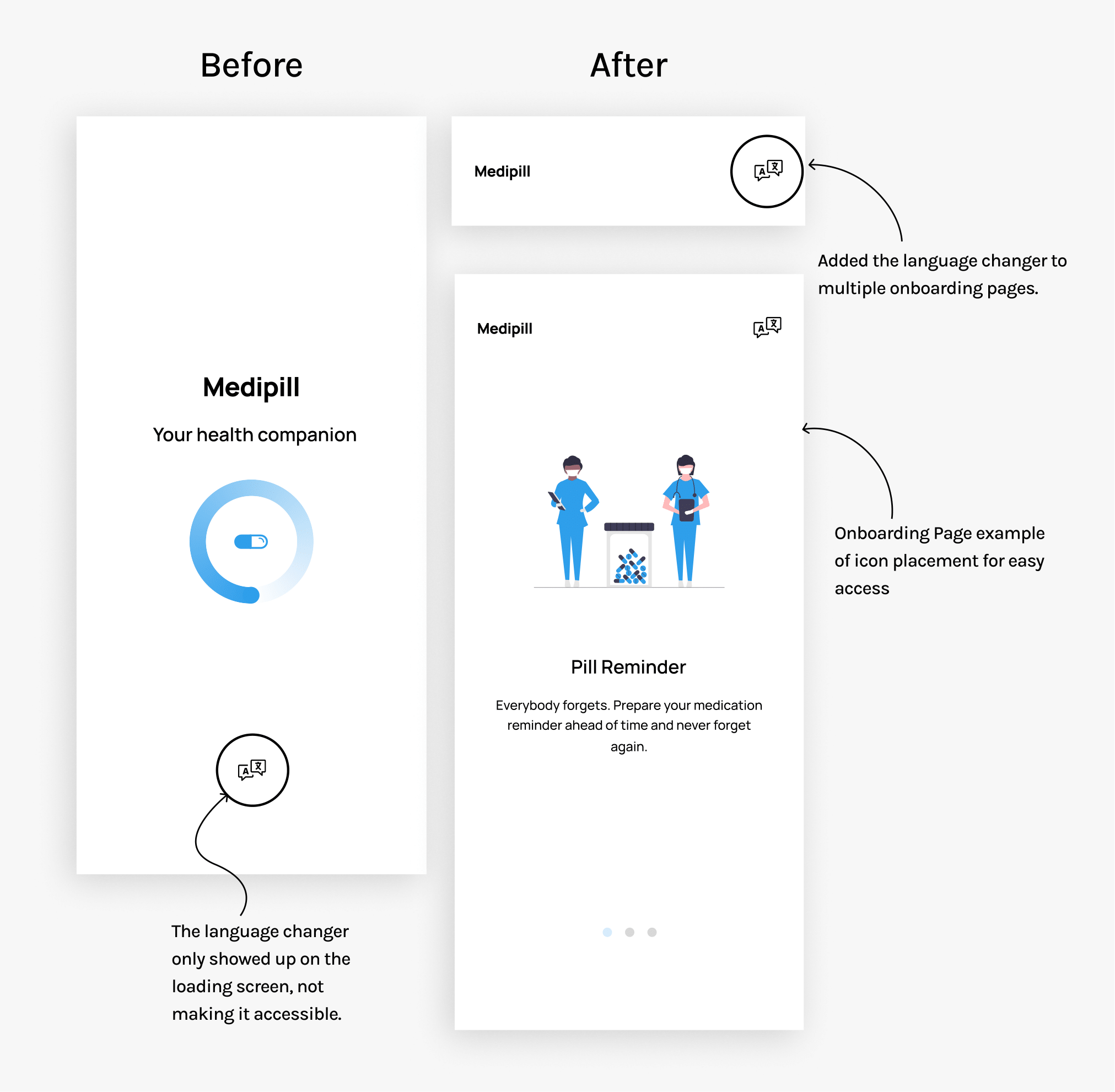
✧ Language Accessibility
I did not add a language changer icon on any screens but the loading screens, giving users only a few seconds to access it. I made sure to add the icon to all the onboarding pages allowing users time to change the language if necessary.
CONCLUSION
What I learned
✧ Laying the groundwork with research
With this project, I challenged myself by building a comprehensive understanding of my target audience that live in a vastly different world than I do as a young, healthy, able-bodied person. This project helped me test the depths of my ability to create solutions that relied heavily on the information I learned during research and usability testing.
✧ Prioritzing
Within the healthcare space, my research led me to many issues that came with my objective. I needed to prioritize properly to make sure that the designs I created would do a good enough job of answering some of the problems that came with this project
If I had more time…
If I had more time, I would’ve loved to create features that allowed users to communicate with their healthcare providers directly and a way to connect their accounts with pharmacies, and a way to track progress over time. I also would love to play with ways to gamify the app to make the features fun to use and more interactive.
Read my other case studies!
Scheduling feature to support content creators improve their engagement and outreach.
Immer
Revolutionizing the way entertainers interact with their audience virtually.